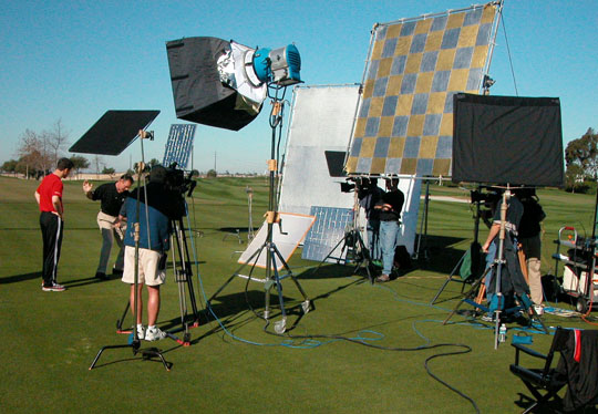
Great outdoor lighting utilizes a combination of artificial and natural light sources. During this production for The Golf Channel and Titleist the sun is reflected from both hard reflector boards, a large reflective cloth panel, as well as daylight balanced continuous light source HMI production lamps.
How to Best Prepare PowerPoint Slides for Video & DVD Production
Many times we have incorporated our client’s PowerPoint slides into their video and DVD productions. Because computer displays and television displays are different, keeping a few things in mind will be of help to both of us.
PowerPoint presentations are optimized for computers. DVDs are optimized for television. There are a number of differences between high-resolution output for computers and low-resolution output for television. Basically, computer resolution is far greater than television’s resolution of 720 x 486 pixels (NTSC). Also, normal televisions at a minimum crop as much as 10% from around the edge (5% from each edge), resulting in a number of consequences when incorporating PowerPoint images into your video production and then to DVD. Keeping the following guidelines in mind when designing your PowerPoint presentation will help insure a good DVD experience as well.
These are as follows:
• Try to use 30 pt fonts or higher as small text may get lost on video.
• Use sans serif (e.g. Arial, Helvetica) bold fonts.
• Use no more than 4 or 5 lines of text per slide.
• Avoid the color red, use darker colors and greens and blues.
• Keep your graphics simple.
• Provide at least a 15% border around the edge.
We realize that these recommendations may seem limiting to you for your live presentation but it helps to be aware of this. In addition, audiences basically prefer simpler graphics. Too much information can cause them to disassociate altogether with the slide.

